Saturday, June 16, 2012
Monday, June 4, 2012
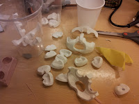
Making of the Puppet: Face replacements
Using face
replacements gives the animator a small
library of expressions, which can be combined together in a big variety on the
puppet. For our story, it was
really necessary to have this library so the mans expressions could more easily be shown, since the film relies mostly on
body language and almost no dialogue.
It has been a while since we made the face replacements,
but here is a small tutorial how approached it:
The inside of the head was carved from balsa wood,
with a silicon eyesocket to keep the eyes in place.
The head was then sculpted in Super sculpey firm and Milliput. The head was sculpted without
mouth shapes or eyebrows, the upper jaw helped the moth to later be sculpted in right place.
The parts that were to be replacable were then cut out.
Imperfections where then fixed smoothed out with milliput and sandpaper.
We made a silicone negaive for each part. The different parts were then casted in plastic.
We made two versions of the main character so that we could animate on two sets at the same time.
Magnets were used to keep the parts in place.
Different expressions where then sculpted on top of the parts.
Layers of white spray where applied before painting the final color.
Credits to Joshua and Nathan Flynn,
who shared their way of making face replacements on their blog.
Friday, June 1, 2012
Character Design
We are still busy animating the last scenes, so meanwhile here is the design developement of the characters!
The man is the one that has been through most changes. We wanted him to be
anonymous, but yet personal, he should be a loner but yet lovable.
And most of all he should look stressed like he has problems and a
lot of things going on in his head.
The creature looks naive and clumsy. He looks cozy, but is annoying and scary to the man. We find this contrast humouristic. He was the first character to be designed, and his design was nailed very early.
Both directors worked on character design, and some of the creature sketches is by Frode.
The creature looks naive and clumsy. He looks cozy, but is annoying and scary to the man. We find this contrast humouristic. He was the first character to be designed, and his design was nailed very early.
Both directors worked on character design, and some of the creature sketches is by Frode.
Subscribe to:
Comments (Atom)


